We are investigating ‘Austere Gray’ by Sherwin Williams. Welcome to the world of complicated gray paint colors (sighh). BUT, I’m going to help ease this process and give you some great, real-life visuals.
You will see Austere Gray in different settings and in different lightings. This will help you get an idea if you want to grab a sample of it as a top contender for your next project!
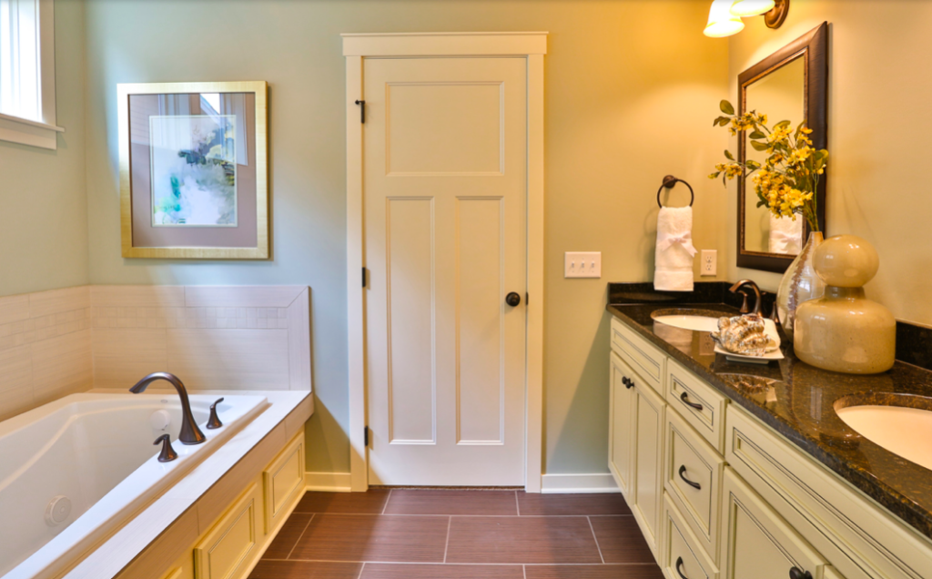
Master Bathroom Natural Light Gives A Green Undertone to Austere Gray
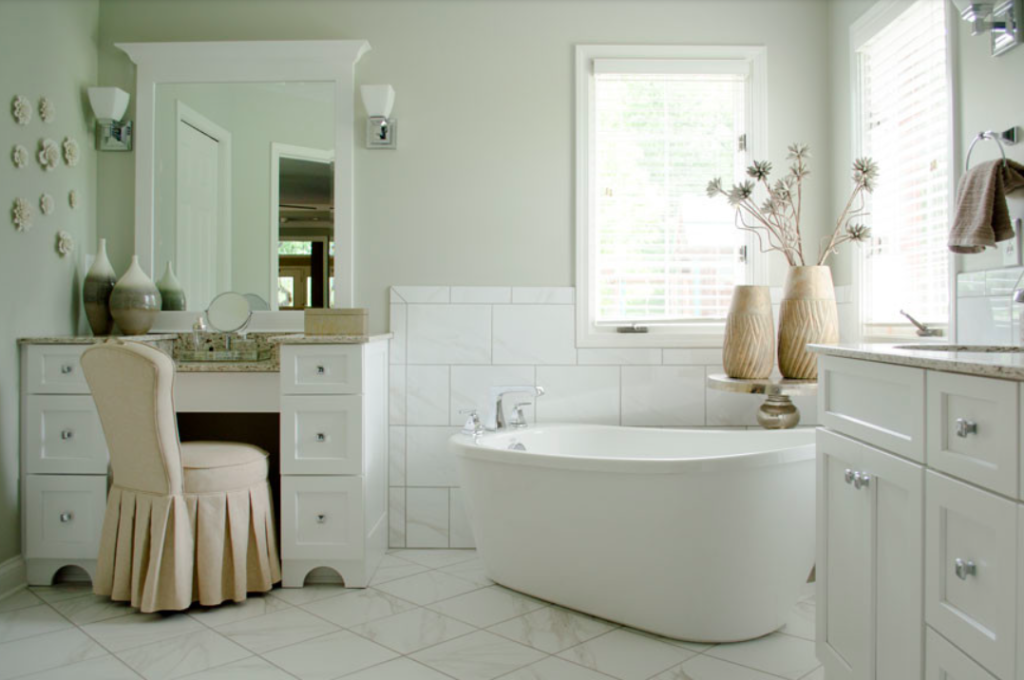
This picture causes Austere Gray by Sherwin Williams to appear more minty-green-gray. Perhaps this looks almost similar to Sherwin Williams Sea Salt. But Austere Gray is nowhere near a minty-green-gray. Rather, this gray has a mossy-green undertone to it.
It is much more warm of a gray than Sea Salt (SW) and Gray Wisp by Benjamin Moore.
I like this wall color as a neutral, calming shade of color to an all white master bathroom. If you need more inspiration for bathrooms and how to better accessorize them and add color, I have an article here about it!
A Warm Gray Cabinet Color Option
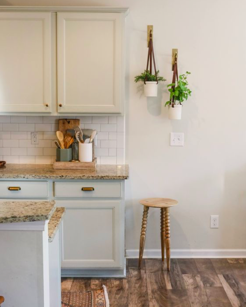
Does your home have warm woods and light tan walls? Austere Gray is a great accompanying option for your kitchen cabinet color. This kitchen has warm granite counters and burnished bronze hardware. But you could easily get away with whiter walls and whiter countertops with quartz or marble.
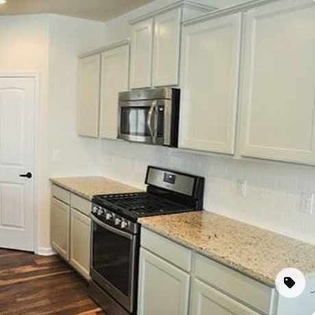
Austere Gray By Sherwin Williams Appears Much Lighter in Rooms With Plenty of Natural Light
Once again, we see this kitchen appearing warm gray-green and lighter than it sometimes looks in rooms with less natural light.
A Helpful Visual Color Guide For Other Paint Samples to Try
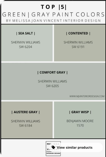
Thank you for this helpful tool, Melissa Joan Vincent Interior Design!
Master Bathroom Wall Color Blends With Earth-Toned: Tile, Cabinets & Counters
Outdoor Samples of Sea Salt vs Austere Gray By Sherwin Williams
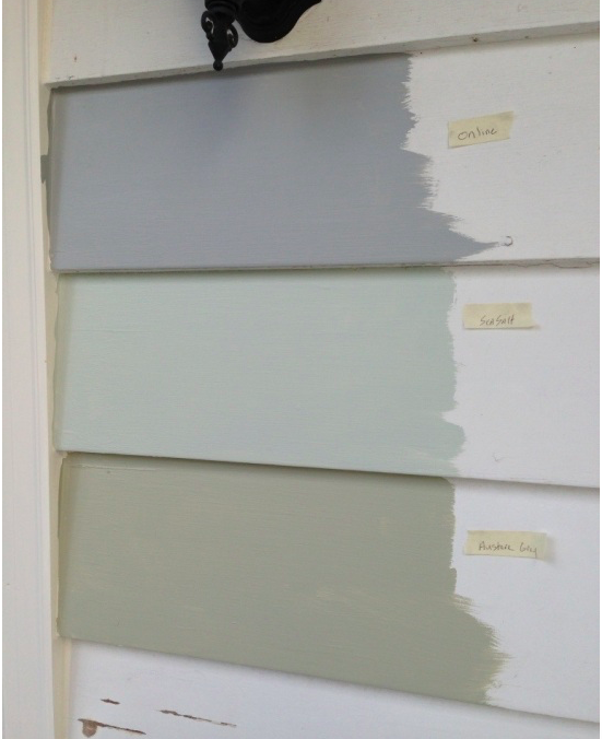
In the above example, the outdoor paint swatches make Austere Gray look like a muted green-khaki. It doesn’t look like it falls into the gray color category! Hence, my point about how gray paint colors can take on all forms!
Kitchen Cabinets in Sherwin Williams Austere Gray
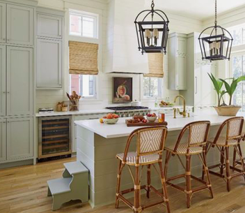
What a breathtaking kitchen! This image made me stop what I was doing to make note of the cabinet color and even drove me to write this whole article devoted to Austere Gray. Notice how beautiful this paint color is next to warm elements such as the seagrass window shades and the warm bamboo-woven barstools.
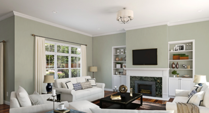
Family Room Walls in Austere Gray


This room is grand and beautiful. I do find it surprising that the walls appear this dark and saturated when we see this same paint color in other rooms looking lighter.
I can’t reiterate it enough to make “paint boards” as I like to call them. Paint your samples on large display boards and hold them in your space at day and night time to make sure you like what your seeing!
Remember, You Can Adjust The Saturation of This Paint Color!
Gray paint colors can so often take on a life of their own. Austere Gray does have green undertones. If you like this shade of color but are struggling to decide if it’s the one for you, remember you can adjust the saturation! What this means is that you can ask for them to make it at 50% saturation, 75%, or even 125% etc. 50% would be half the darkness of the original color.
This concludes our exploration of Austere Gray paint color. Clearly, the world of green grays is vast and complex. But I hope this article can help give you a little more clarity to get a sample for your next house project.
Your gut is the final deciding factor. So choose what speaks most strongly to you and make sure to have two other examples side by side for reference.