The fact that you’re reading this tells me you’re already on your way to an amazing bathroom design! Implementing one of these bathroom cafe curtain ideas can elevate and customize your space in the most wonderful way. It’s a sophisticated touch that often gets overlooked.
Here are some amazing bathroom cafe curtain ideas for inspiration. Hopefully one of them is a perfect match for you to utilize in your own bathroom. Best of luck!
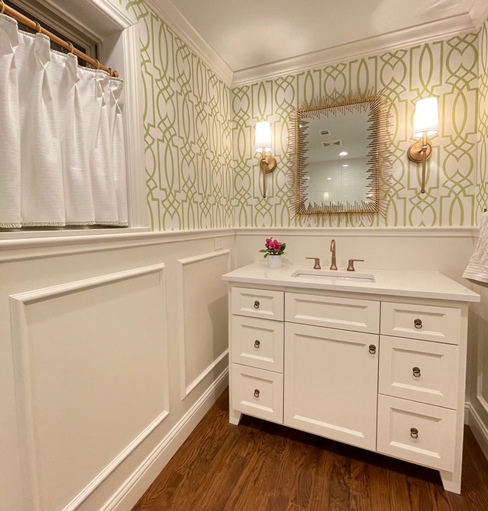
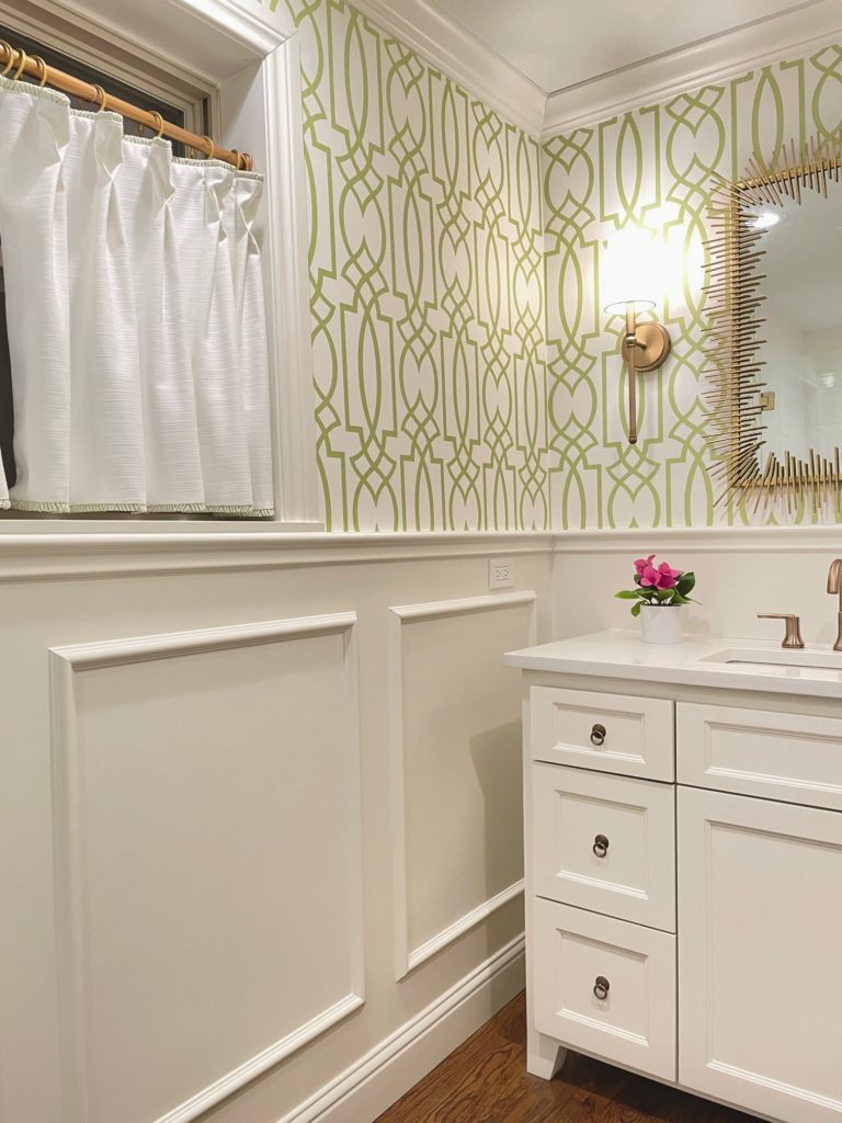
The below powder bath is actually one of my very own designs by Whitney Clark Interiors! I love the combination of green and gold, therefore, I kept it simple with this window treatment.
However, there is a citrine green flange on the top and bottom of the cafe curtain that matches perfectly with the wallpaper! This is an easy touch that is worth it.
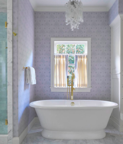
Warm White Cafe Curtain with Coordinated Purple Color Trim
The best bathroom cafe curtain ideas still follow set rules: If you have a tall window, do not cover the whole length. Use the 2/3rd’s rule or cover 3/4’s of it, whichever option looks most natural to your eye.
Because the emphasis is on this serene purple wallpaper, it wasn’t hard to just go basic on the fabric and focus on the perfect purple ribbon trim to coordinate with it.
Add Color To Your Bathroom With This Cafe Curtain
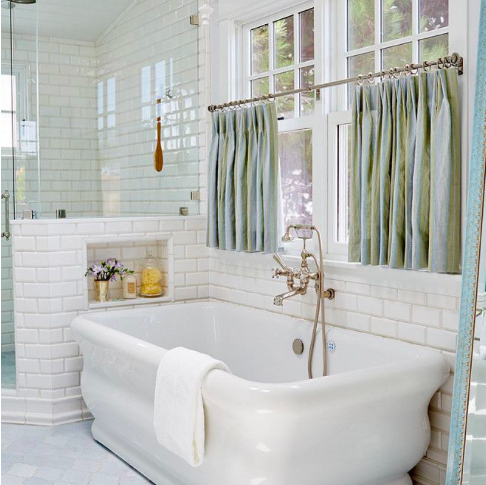
A sophisticated sea-foam green cafe curtain is the winning ticket to this bathroom space. It adds a feminine touch with softness and grace. The color is well suited for the space and shows in a timeless manner.
Are you stumped on what fabric to use for your bathroom cafe curtain? Perhaps a subtle green-gray linen would be a great option for you!
Another important step to getting your fabric right is to order samples of the fabric. Whether online shopping or in person, bring a sample of the fabric, home to your space!
Tape the fabric on the wall and “live with it” for a little while. You’ll be amazed how much you will either love it, or get tired of it after after a few days. And this will show you if you need to get a few more samples of fabric or feel confident in your choice.
Opposite The Color Wheel, Coordinating Colors!
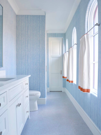
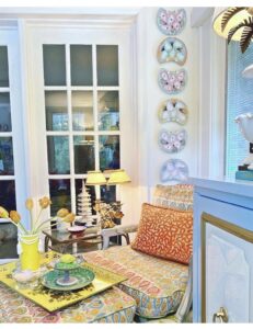
Tone on tone, blue on blue is a great design scheme. Yet how fun is it to have a pop of the unexpected orange? Can we imagine that just a little deep orange, as seen in this picture takes this bathroom from cute to fantastic?
The eloquent yet non-fussy hardware extends in front of each window rather than within the window frame. Once again, this bathroom cafe curtain idea follows the two-thirds rule and covers only that much of the window. Lastly, this allows a wonderful amount of natural light to flow in while still keeping privacy.
The cafe curtains look lined and heavy-weight. This adds a luxurious feel. And finally, the deep orange tape trim (or ribbon trim) lines the bottom to draw your eye into the space. Job well done!
Do you have a colorful bathroom that you could also throw in an additional color with the ribbon trim? Maybe a blue bathroom and peach trim? Perhaps a white bathroom and lavender trim? Or a white and gray bathroom and pink trim? Your options are numerous but challenge yourself to think outside the box!
Just the Littlest Touch of Magenta Pink Flange on White Cafe Curtain
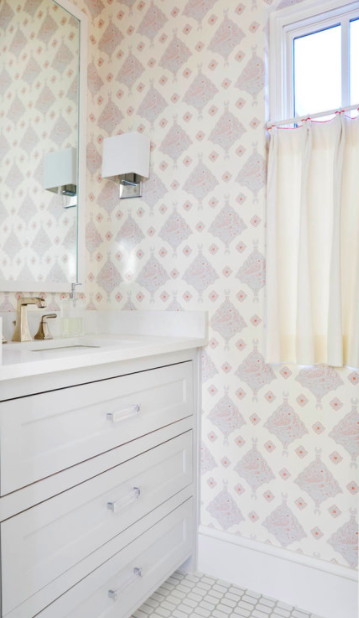
It’s all in the details. And this truth withstands the test of time. Just to clarify, a “flange” is a folded trim or piping that is added to the edge (top or side) of the fabric drape.
This very inspiration picture helped me realize I wanted to do the same top flange on my green wallpaper bathroom. And in my case, I actually added a green flange on top and bottom of my cafe curtain for added color.
Thank you Jenkins Interiors, you’ve inspired me yet again!
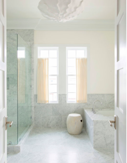
Blue Wallpaper & Cream Cafe Curtain
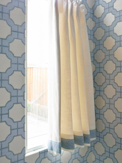
Ok guys, I’m going to draw an important distinction here, so listen up! Pay attention to the difference in bright white and off-white. In all the pictures we have looked at, ask yourself: how many cafe curtains are bright white…. NONE.
So, what I’m trying to impress upon you is that creamy or off-white is the direction you want to take. Sometimes bright-white says IKEA or Amazon quick-ship. And nothing is wrong with those! I have utilized these less expensive options. But, my take away is that spending just a little more on the fabric really does go a long way.
Recently, we underwent a massive, master-bathroom renovation. I cut corners on the fabric for our bathroom cafe curtain and I still hesitate over it. Ugh, shame on me! My hesitation to spend a little more money really does keep kicking me in the tush over and over. I walk into the room and have an inner dialogue with myself regretting the mediocre outcome.
A Fail-Proof Cafe Curtain Color Option: Blue-Green in Linen
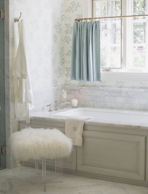
So, here we have a blue-green, soft, linen fabric. This is such a soothing fail-safe option to add to a bathroom for the cafe curtain. What also takes this room to the next level is a subtle all-over foliage pattern wallpaper.
One more detail that is also a great touch for the cafe curtains is the small scale pom-pom trim. Think of these details like this: They may be annoying to nail down, during the project, but after the fact, the details are everything. Case in point, try to add a trim to your cafe curtains, whether it’s along the top, along the bottom or along the side.
Bathroom Cafe Curtain Ideas: Add A Subtle Pattern Or Stripe
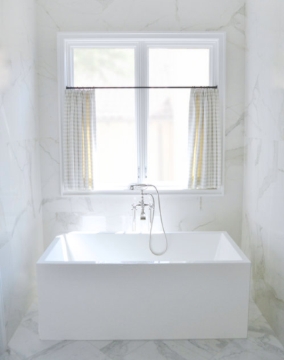
Oftentimes, we think that too much white in a bathroom can fall flat or be uninspiring. But this is not the case! When individual pieces have a touch of eloquence, i.e. the modern square bathtub or a fancier water faucet, your bathroom truly will come together.
And the cafe curtain is where you can add your flair! Think about it, neutral whites and marbles do blend well together. And then your cafe curtain is a more easily replaceable accent piece.
The stripe fabric is a creamy white background and a tan or gray stripe. This color combination is a great idea. It lends a traditional – transitional vibe to the space.
And like we have seen with other cafe curtains, it’s fine to mix the creamy white fabric with the brighter whites of the tiles. This is definitely not an area where the whites need to match.
Pop of Peach Cafe Curtains
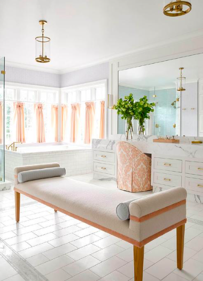
If this isn’t the essence of happy, I don’t know what is! Shout out to the husband on this project for him letting his wife and designer lead the way and trust the outcome.
Notice how much personality is brought into this room with a warm color such as this coral-peach. These are easy details to swap out (if you ever sold the home). The cafe curtain, bench and vanity chair all coordinate this color together and the outcome is spectacular.
Deep Cream Cafe Curtain Mixed With Marble Tile & Counter
In this example, the cafe curtain is such a prominent feature to add warmth to this space. Remember, if you have an opportunity to add fabric to a bathroom, go for it! It will help the bathroom feel like a cozier extension of the home.
At first guess, I never would have thought that the creamy yellow fabric would translate so well, but it almost acts as a pop of color against the marble!
Grand Finale of Bathrooms & Cafe Curtains!
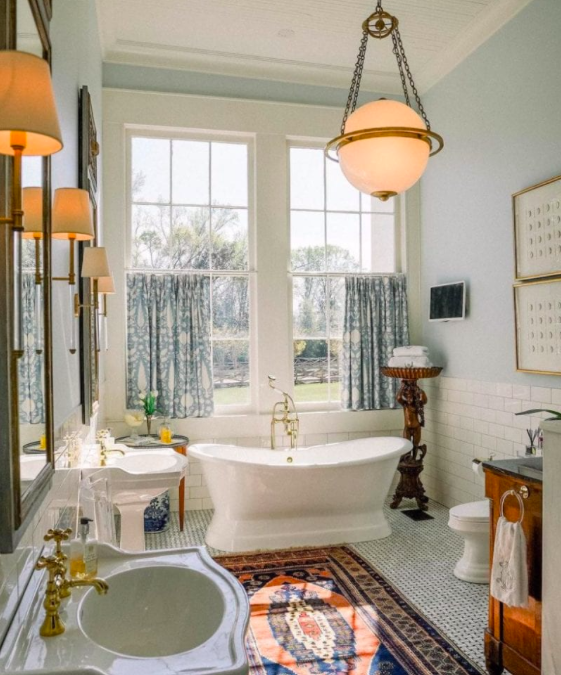
This bathroom has “all the things!” I hope that doesn’t over simplify it. Where to begin? I guess I’m so drawn to this room because they incorporated many things that you don’t always find in bathrooms.
They incorporated a great oriental rug with navy and orange-red. There are pops of dark wood in the corner pieces of furniture and vanity. There are then polished brass accents on the faucets and light fixtures that speak perfectly with the gray-blue denim fabric of the cafe curtains.
And, these cafe curtains are abundant in fabric! What do I mean by that? There are probably 1.5 or 2 full panels of fabric here. In contrast, if too little fabric had been used, say 1 panel, you would only see about 7 folds. Instead, there are most definitely about 14 folds, meaning they used 2 panels of fabric.
These details count! You almost can’t overdo it on fabric. In this scenario, less is definitely not more.
Hope these ideas help you along your way!